Monday, October 7, 2013

more "Inktober" efforts

I'm doing daily ink sketches and I generally can't resist adding color. I may try black line and gray wash as a compromise--so I will get more line aware. I'm still startled by drawing with a bold thick line...but I'm having fun.
Will soon go back to a daily poetry prompt too. Having Pocket Park published is great, but it also leaves me empty of a current poetry project. And until I get obsessed with new themes, time to just do it, keep writing and drawing. It is so good to do throwaway creative exercises. Occasionally something worth keeping, developing, comes out of it.
October is for familiars and witches.

Houndlet performs the Danish play.
This time, just ink and ONE color.

Wednesday, October 2, 2013

Book Launch for Pocket Park

Friday, November 15, 2013, 7 p.m.
Poet's House
10 River Terrace, New York, NY
(212) 431-7920
poetshouse.org

Pocket Park is published!

Yes, October 1st came and the status of my book is no longer "forthcoming" but "adopt me!"

Going on press to check color was a huge good thing to do. I was sick with a cold, but with tissues on hand, I took the LIRR out to East Rockaway, NY. where Sandy McIntosh, publisher at Marsh Hawk Press, picked me up and drove us to the printers, Sterling Pierce. After four tries we approved a better cover than Michael Arguelles, the color tech guru, had at first shown us. He was patient and ultimately shifted the cover to another machine that was able to deliver more contrast and saturation than the one printing the interior.

The interior looks really good, it helps to be on glossy brochure style paper. After getting a first set of proofs at home last month I'd adjusted color slightly on nine of the interior photos (too dark or too light) and now they printed just fine. I've created a color setting in Photoshop for each printer I use so the screen emulates their color. It's working, I'd guess about 90% on target, since a piece of printed paper will never be as bright as the stained glass effect of a glowing monitor. Or in design-speak, two different color spaces, CMYK vs RGB (like comparing Olive Oil to Popeye in a battle of color strength).

Digital color printing still isn't the equal of a traditional full 4-color press...but...it's gotten a lot better in the last several iterations of the machines that churn these pages out. The digital printers are basically a seven foot long photocopier. Traditional presses can be the length of an Olympic sized pool and wide as a semi! My photos don't depend on subtle shifts in skin tone, that would be hard to do digitally. Pocket Park, visually, is about mid-tone gray and tan geometric urban planes contrasting with saturated hues of water and foliage. An urban park in color. With poems in black ink Garamond.

Sandy asked me to pick some photos from the book to put on the Marsh Hawk Press gallery section of their website. And to talk about how the book came into being, including my experience working with digital color. So here is my day wearing three hats: poet, photographer, and book designer. All three happy.

The skilled Michael Arguelles with me at Sterling Pierce, printers.
Due to head cold, I'm having a massive bad hair week.

Sandy McIntosh, publisher at Marsh Hawk Press.

4 pages to a sheet.

Look! My title page! Sandy tends to blink into the flash,
honestly he looked lots happier than this.

Good color all the way through.

Approved to print & bind.

Inktober, or how to get practice for a month drawing in ink

October is Inktober. Who knew? Now you do too. One a day.
Here is Mr. Acorn, based on nuts stolen from squirrels on a walk with my daughter Caitlin 2 weeks ago in Central Park. She also draws in ink, in her case, the blue and black of everyday ball point pens. This was drawn with a Pentel marker/brush and colored pencils.

Sunday, August 25, 2013

Mom, Julie Harris, and me, a cautionary tale

My Julie Harris story.
When I was 9-3/4, my mother took me on her yearly weekend trip to Vermont to visit her old high school. We stayed at the Woodstock Inn for a night and visited the town, woods, and ski slopes where she'd perfected her "Christys," and drove by the turn-off to the Woodstock Country School as she extolled the delights of hiking and fresh air in her Brooklyn accent. Larry Hagman had also gone to that boarding school, a year or so ahead, but they weren't friends, especially since Mom wasn't a bit interested in dating boys.
On our way back from the pilgrimage to my mother's youth, we pulled into a restaurant in Connecticut to get a late lunch and help me recover from the car-sickness I felt from my mothers smoke filled-car and its rough rocking suspension.
"I'm sorry, we just closed."
"My girl really needs something to eat, could you please see if someone in the kitchen could help us with a bite?"
I was pale and swaying.
"All right," said the waitress returning from the chef, "but you can't sit in the dining room, we have a private party there, we can seat you in this side room."
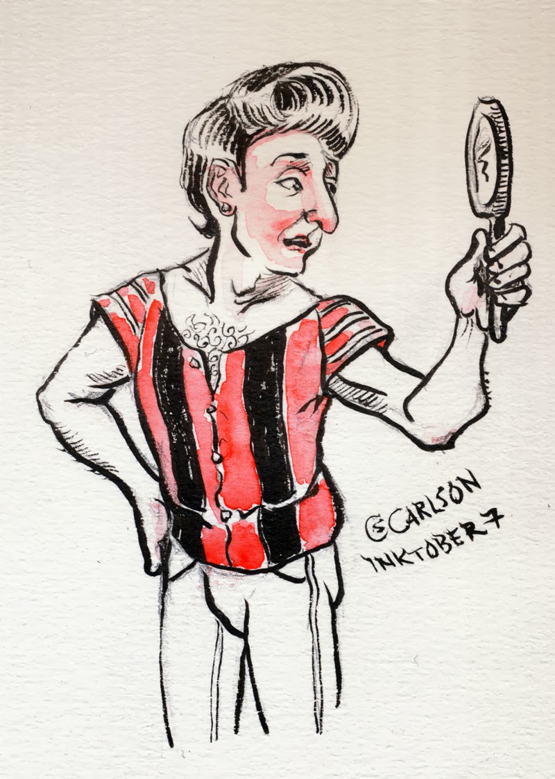
As we followed her, Mom glanced through the dining room door as it swung shut and grabbed my arm and hoarsely whispered "Oh My God! Julie Harris. JULIE HARRIS!!! is sitting in there!"
Mom kept muttering Julie Harris to herself.
We sat down. I gulped my water and ate a breadstick. Mom stared at me. She tentatively tried to straighten my bangs (impossible), push the topiary of curls out of my face (hopeless), and reposition the cat-shaped tortoise shell eyeglasses that habitually slipped off-tilt down my nose.
"You're cute, all kids are cute," she began. I could see she was doing her best to believe this. The drool stains from when I'd managed to fall asleep sucking on a stick of licorice hardly showed on my shirt.
"Look, you're out of water, you walk in there with that empty glass and nicely ask the waitress for more water and then when Julie Harris looks at you tell her how much you loved her in The Member of the Wedding. She played a kid in that. Perfect. Go on." She wiped my mouth with a corner of her napkin. Squinted. Removed my glasses. Then wet her palms with water and squashed down my hair. "Go now. Better without the glasses, go on."
I was deeply myopic. I only bumped into a few chairs heading into the dining room peering about for the waitress… Julie and the man were absorbed in one of those tense weird adult conversations full of silences and conversational stabs. I tip-toed over. My heart hammered. Julie was skinny and not that much bigger than me.
"Could I please have some waaaa…." I began.
Julie and her companion startled and stared at me with the same expression one gives a newly produced hairball.
"I told you we wanted privacy, privacy, get out, get out!!" She shouted over my head.
The waitress ran in, a white aproned blur.
"Get out!"
I ran.
"We're never coming back here! Get me the check." was the last I heard.

I rejoined my mother, breathless and red-faced.
"How did it go, did you get her autograph?"
I shook my head.
"No…I don't think she likes kids."
"Mmmm, actresses, probably don't know what they're missing not having a girl like you."
I put my glasses back on and decided I'd earned French Toast with whipped cream for lunch.
"How could she not like you, you're so cute?"
"I dunno."
"Why didn't you get water?"
"Waitress wasn't there."
"That's where you went wrong! You should have waited to ask the waitress for water, you don't ask Julie Harris for water."
"I'll never do it again, Mom, promise."

Saturday, August 10, 2013

Let the book get printed, embrace promotion!

I am almost ready to send Pocket Park to the printer! Print proofs look good, I did final adjustments to a half dozen photos... It is getting one last proofreading before it goes because, you know, I don't want any new typos creeping in and having you, dear public, gently point them out.

My friend Flash suggested I could lead a workshop on how to take a regular lunch hour hangout and turn it into a project of seeing, of being there, using more of your senses, in the course of a year. That would be fun!

As I let this project stop, no more changes, revisions, additions, or deletions, I am still aware of the more perfect book I wanted it to be. This ghostly betterness has once again slipped my ability and I'm left with doingness.  I created this book to the fullest, the most that I could and that feels right. I wish I had better mental and physical equipment (a small DSLR would be able to capture motion, which my pocket camera cannot) but hey, I can only be the me I am and as much as I'd like to borrow some O'Hara, Sylvia Plath or Donald Justice, Diane Arbus or Vivian Maier... I was stuck with me. No, revise that, I was me but I paid attention.

I will give readings and see if the Eventi Hotel wants to work with me on a way to celebrate the book. I can create a site. I'm agog.

My mind is turning to new books, in the perfect blur of possibility. Like falling in love. The work-in-progress is saying, Claudia, this time, this time you will get closer, and in the process surprise yourself. So here I come, goodbye done, hello beguiling.


Thursday, August 1, 2013

My first article on making fantasy maps is published!!!

I just received my copies of The Portolan, journal of the Washington map society. In 2011 I gave a talk in the map room of the library of congress to the society. The editor of the journal, Tom Sander, asked me to turn it into an article, with some of the images that had been in my PowerPoint slideshow. Since I'd sort of gone off script in the talk, my nervousness just miraculously evaporated as I spoke, I recreated the jist and added more to explain what I've learned over the years of making literary invented worlds become visible. I also looked at how changes in technology shaped how I worked. Not to mention fitting a universe in a tiny poorly printed paperback page. I got a bit more personal than the journal was expecting, but hopefully, their readers will enjoy hearing, again, about the joys, and sometime failures, of this particular craft.


- Posted using BlogPress from my iPad

Thursday, July 11, 2013

Final moments on cover and then I WILL MOVE ON

Creating the ad for Fall 2013 Marsh Hawk Press books...there are two launching. Pocket Park has met its final count down. So will it be PATH, REFLECTION, or TREES?


Sunday, June 30, 2013

Cover me round 2, more abstract mostly

I thank everyone who voted on the covers I put together yesterday, your comments and reactions got me thinking about getting more mysterious, abstract, and focused. So here are today's contestants (click to see larger):

A, front runner from yesterday

B

C

D

E

F

G

Saturday, June 29, 2013

Cover me!

I'm finishing my book Pocket Park and getting files ready to go to the printer. The inside is done, the library of congress data arrived and I put it in its slot on the copyright page, I've made final corrections, and it will soon fly out of here on it's electrons.

But now—the cover. Do I have the best photo for it?

The one I picked is rather dark, suggesting the poems are likewise, and mostly, they aren't. But I'm afraid of using something too bland, too meh. So tell me, which ones look best?
Note, A is the current cover.

A
B

C

D

E

F

G

H

I

J

K


Summer Haiku

Trees discuss the heat,
lack of soil, they sigh and creak
in their rough girdles.


The US Open in the Pocket

The ball pocks
from serve to racket
heads swivel
following the play
on the outdoor
mega-wall display

pock—pock—pock
the pixelated ball
is the irregular beat
of a collective heart

sparrows hop
close and closer
to unguarded bounty
as Forest Hills
thrills New York county.


Friday, June 28, 2013

Da Dawg Days in June

 
Sculpture in plastic clay of a character for a kids book I'm writing. Oh this is fun.

I used to sculpt a lot in high school. But when I got to college the studio art department was in the grips of worshiping abstract and conceptual art. Especially in artist's statements.

"Carlson, paint what you feel!"
Me, "I'm a freshman, I don't know what I feel. Can't I paint what I see?"

They thought they could quickly turn us 18-year-olds into Pollocks just by skipping the whole old fashioned training in anatomy, perspective, and color theory. Talent trumped technique.

They didn't much like realism. They sneered at illustration. The word "cute"was the worst insult. Sigh. So I became an English/Art History major. And turns out life is funny that way, discovered how much I liked writing and reading poetry. And kept reading children's books and cartoons.

Friday, May 31, 2013

Rewriting against the clock

My second book of poetry (Pocket Park) will be coming out this Fall, but thanks to sequesters and unknowable seethings in the Library of Congress, my library data is held up. This offers the self doubting poet an excuse to revisit the entire book looking for awkward verbs, sad near rhymes, and potentially horrifying verbal gaffes on a par with my recent sartorial mishaps (the navy blue and black sock debacle on Tuesday). And in my deepest soul I wish I had written the deeper, funnier, more astonishing and intelligent book I envisioned at the start. But this is the truth of it, like watercolor, once the paint of a poem dries, it looses some gloss and movement. Unless you're effing brilliant like Plath but god knows I don't want her self-imposed deadline.

I've been reading many poets on revision. Such great advice. Decided to follow all of it. I've got one poem I'm putting through the paces right now. Made it shorter, expanded it, rhyme, no rhyme, amoeba like, tailored to form, mixed it up...and the poem remained of faint interest, no zing. It needs more of me somehow. Great, how do I extract heart, experience, and vision and make it new?

I'm sipping a small glass of sherry...Amontillado...and pondering options. Going to sleep sounds good. Getting out from behind the wall of myself sounds better. Hand me some TNT and courage please. Or maybe I need to stop being so pleasing. You must kill the obvious darlings, the poet as her own editor must be fierce.

Mmmmm, a vintage port would be nice. No poetry readjustment bureau tonight. Tomorrow is Jim's birthday, we plan to go write in a cafe and nibble appetizers. Poem, gird yourself. Deadlines.
- Posted using BlogPress from my iPad

Location:Couch

Sunday, January 13, 2013

Less is Less Unless it is More Good News

THE LESS AND LESS PART
Last week I visited the Utrecht Art store, near where I work, and discovered their big redesign of all their retail outlets meant they dumbed down their offerings. Gone was the large cutting table where I could layout boards and decide how to frame my art. Gone were the useful array of books on art and technique (now down to one woefully inadequate kiosk with a dozen fairly useless titles and not even one book on calligraphy) and the general air of being a place that mattered was gone. I had remembered an energetic knowledgeable staff, dynamic manager, shelves with many good choices of tools, papers, and paints...and discount tables. It is now a sort of E-Z artsy store, akin to the art section in the Micheal's Craft stores. The place was like the cat that had gone to be "fixed" and came back with depleted interests... clearly the digital world is affecting viability of art stores. Will they mostly go the way of bookstores leaving behind just a few small specialty shops catering to real artists?

Lately I've had a "Potemkin Shelf" feeling at the big Barnes and Noble (Broadway and 82nd Street). As if the books being turned face out were the last in line. There's a subtle thinning of the stock...just what Borders went through in its final months. It makes me sad. Bookstores have been a mecca for my cover design eye and a feast for my insatiable reading heart. And big mega stores just means more walking and looking and browsing—a place where I pleasantly split into two selves in one, my body relaxes into a slowly strolling trance and my mind and eye are darting and diving—reuniting at the end of the checkout line. Luckily I still live in a college neighborhood where print books will last as long as there are students and professors to read or assign them. Also, I thank the graces for the New York Public Library....

THE GOOD NEWS PART
Yesterday I ran over to Book Culture and bought a used paperback copy of William Carlos Williams book long poem Patterson. I am writing a book of poems about a small urban park—sharing space with my photos. I'm looking for inspiration, other ways of seeing. This tip came from Paul Pines, "one of the best collections of cityscape poetry is by my old friend and mentor Paul Blackburn in a book called The Cities, published by Evergreen. I recommend it highly. And in all of his work Paul had an eye for detail and ear for sounds and speech that was peerless and informs his work. He was a protege of Williams, whose classic book Patterson is another great one (both alluding to Lorca in some way, his Poet in New York). That book by Paul contains his great good-bye to W.C., "Phone Call to Rutherford," that great moment when Williams, unable to speak because of his heart attack, says, "...you have made a record on my heart."" I had looked at passages from Patterson back in college but what a different rich cornucopia it is to me now! Thank you for the leads.

So this brings me to my news, my book, Pocket Park, will be coming out Fall of 2013 from Marsh Hawk Press!!!!!!! I have 4 months to take the rough manuscript and finish, rewrite, reimagine, and find where I can add or subtract. What are the best city park poems you have read? Let me know, I'm stoking my imagination for the work and play ahead.